Think of user flows as blueprints for user movement. Whether someone is purchasing a product, signing up for a newsletter, scheduling a service, or completing a multi-step form, each interaction involves a sequence. If that sequence feels logical and smooth, users move forward. If it’s confusing or disjointed, they hesitate—or leave altogether.
Designers often begin with empathy: What is the user trying to do? What are they feeling at each step? What decisions do they need to make? From there, the path becomes clearer. A successful user flow balances business objectives with user goals, aligning the interface structure with real-life behavior.
Mapping out flows early in the design process helps avoid expensive missteps later. It clarifies what screens are needed, what content must be present, and how users will move from one point to another. For teams, it creates alignment—everyone understands the logic behind the journey before visuals are introduced.
User flows aren’t just for new users or onboarding experiences. They apply to every kind of interaction, from quick tasks like resetting a password to longer journeys like comparing multiple products before checking out. The more complex the goal, the more important it is to visualize how users will get there.
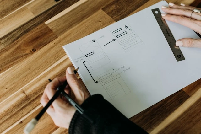
In practical terms, user flows take the form of diagrams or flowcharts. They include decision points, actions, and screen transitions. This visual thinking enables teams to spot potential friction points—steps that feel redundant, unclear, or unnecessary. It also helps optimize for different scenarios, such as logged-in vs. guest experiences or mobile vs. desktop behavior.
Designing with user flows in mind creates clarity. It ensures each screen has a defined purpose, with content and components that support a specific action. This leads to cleaner interfaces and more intuitive navigation, both of which reduce cognitive load and improve user satisfaction.
A strong user flow also enhances conversions. When the steps between landing and outcome are direct and meaningful, drop-off rates decrease. Removing one unnecessary field, combining two redundant steps, or surfacing relevant information at the right moment can all have a measurable impact.
Beyond structure, user flows shape emotion. If the experience feels smooth, users feel confident. If the flow is thoughtful—anticipating hesitation, providing validation, offering shortcuts—it builds trust. And trust is what turns a first-time visitor into a returning customer.
One product team working on a SaaS dashboard recently overhauled its onboarding experience by simplifying the user flow. They cut the number of initial steps by half, grouped related actions into single screens, and added smart defaults. The result was a 40% increase in successful onboarding completions and significantly lower support requests during the first week of use.
What’s important to remember is that user flows are not static. As user behavior shifts or new features roll out, the flow must adapt. That’s why ongoing testing—through user observation, analytics, and feedback—is vital. Even subtle changes in behavior can signal that a flow needs refinement.
While design tools have become more advanced, the core principle remains unchanged: design should support the user’s path, not get in the way. Whether the journey is one step or ten, it should feel intentional and intuitive.
Digital products live or die by the quality of their interactions. And those interactions don’t begin with visuals or code—they begin with flow. Designing with user flows in mind means designing with purpose. It’s about more than getting users from point A to point B—it’s about guiding them there with clarity, empathy, and precision.